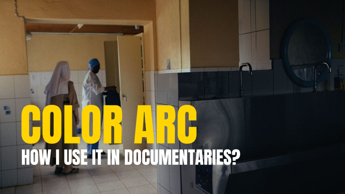
What Is a Color Arc and How I Use It in Documentaries?
When I begin color grading a documentary, the first thing I do is watch the film from start to finish with sound, exactly as it is before any sound design. Just me and the draft. I do it not to check continuity or exposure, but to understand how it feels. Then I color‑code the scenes, write on‑screen text notes, and sit with the director and/or the DP, and we talk. We pause when something feels important. We repeat moments that carry weight. We argue about meaning when needed. I ask a lot of questions. Sometimes I repeat those questions over and over again until I’m sure I’ve understood their vision as clearly as possible. This is how documentary color arc arises. This part matters more than any tool or node structure. Only then can I start shaping the color.
How I Define a Color Arc
A documentary color arc is the emotional logic behind the film’s visual tone. If you do it well, you stop being a picture-driven colorist and start flourishing as a story-driven one. Documentaries often create the impression of being realistic, natural, and nonfiction – and they are nonfiction; the stories are real. However, the image itself is never a perfect reflection of reality. The moment light hits a camera sensor or film stock, the picture turns into an interpretation shaped by technology. Everything in the chain; sensors, color spaces, lenses, LUTs, curves, algorithms – reshapes what was in front of the camera. In the end, you’re not capturing reality; you’re capturing a version of it. And that version is where a story-driven colorist can begin to work with intention.
How I Build It in Resolve
I divide the project into scenes. Each scene gets its own emotional direction, translated into a simple color choice:
- Orange for warmth, safety, connection
- Teal for cold distance, sadness, or an unreal atmosphere
- Pink when I want to underline feminine presence or energy
- Neutral when the scene requires observation without emphasis
This isn’t theory. It’s practical. It helps me keep the film emotionally organized. I group scenes in the Color page. Each group has a place for the scene look, which sits between the global look for the whole movie (Timeline) and the clip-level fixes (exposure, white balance, skin corrections, etc.).
The hierarchy is clean (from the top):
- Timeline-level look development
- Group Pre-Clip: CST from Canon C-Log3 to DWG
- Clip Level: corrections done in original C-Log3
This is stable, predictable, and aligns with the Volpatto-style workflow I prefer. But the structure is just a tool — its main job is to keep me organized, help automate the workflow between me and the software I use, and prevent me from falling into a chaotic node mess where it’s hard to understand what lives where.
The Important Part: Understanding the Scene
Color only works when the emotional intention is clear. And that comes from conversations.
We talk about:
- what the director wanted to say in each moment
- what the DP responded to on set
- why certain scenes feel heavy or light
- what emotions they want the audience to feel
- what the story is truly about beneath the surface
- where all of the above was possible to achieve or think about, and where the filming was so guerrilla‑style that we were simply hoping for some divine guidance
When that understanding is clear, the color arc becomes obvious. The palette choices feel natural, not forced.
This is why I don’t chase “cool looks.” I chase story and clarity.
What Directors Usually Notice First
After the first pass, directors often tell me: “I didn’t even realize this could look so good” or “Even in my wildest dreams, I couldn’t imagine that this was there.”
Their reaction isn’t about creating a more dramatic or stylized image. It comes from finally seeing structure, meaning, and emotional transitions that weren’t obvious in the raw material. And even if you edit with color-corrected, positive, Rec.709 dailies, which I strongly recommend – the difference is still huge. Please don’t edit Log or digital negatives.
Color brings intention forward. It connects the story instead of simply decorating it.
Why sometimes non of this work
Over the years I’ve dealt with many different kinds of footage. Sometimes there are beautifully lit images where everything falls into place from the very beginning. But other times you simply have to make peace with what you have and try to get the best out of it. Mobile phone videos, old GoPros, heavily compressed files, incorrect camera settings, auto white balance, auto exposure, badly exposed shots – the whole spectrum.
In those cases, you accept the limitations, do the work, and push the image as far as it can realistically go without breaking it. And still, the story is what matters above everything else.
Why I Work This Way
Documentaries are unpredictable. Different cameras, mixed lighting, fast shooting, real-life chaos. Without a clear documentary color arc, the film feels disconnected.
My process allows me to support the director’s vision without pushing my own agenda. My job is not to impress anyone with a “look.” My job is to help the story land with the audience.
Color grading should make the film feel right – nothing more, nothing less.